It was early when I wrote yesterday’s post and apparently my brain hadn’t warmed up yet. In any event I meant a GM’s screen, not shield. I could have just gone back and edited it but I make mistakes and everyone is just going to have to get used to that. 😛
I have the data half of the screen done. I was surprised that I had to go searching to find things to put on the screen. It makes me happy that I didn’t have to leave things out that I wanted to have on there and that apparently three pages is enough to cover nearly all the tables you’d usually have to use. I seriously thought I would be leaving a lot out.
So here’s what I have so far.
GM’s Screen PDF
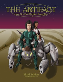
There’s no artwork yet, I might put something on the GM’s side and I need to start on the player’s side. I have an idea of something to put on it but I’m not sure of it yet. I’d like this to be done by Friday but I’ll admit, making a large format picture like that from concept to completion is a tall order for me. I might post my progress as I go (hopefully there is progress).


 The Free RPG Blog
DUDE!!! THIS IS AWESOME!!! It just needs something that the players can see, like a picture for the other side, ya know?
That’s what I need to work on, I’m just not making much progress right now. Crazy week I tell you.
Btw I’m liking the look of the blog, this does seem more friendly for anyone knewer stopping by… Whats the link to the forums again? :s
The forum is here. We haven’t been using it and I’m not sure what I want to do with it. Maybe I should have a link to in on the blog here.
Yeah I suggest putting a link for it here on the blog. That thing has been around for to many years to drop now, besides I personally find a forum setting to be much more “fun”.